


A trip to Brussels, Belgium just got more colorful thanks to the folks who brought us the Pantone Matching System (PMS).
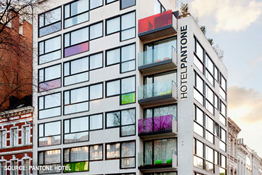
They’ve taken a giant leap from producing the flat pages of their swatch book to building a color-saturated, multi-storied building. And they’ve named it the Pantone Hotel™.
Since the 1950s, the PMS has been a staple of printers, graphic designers and virtually anyone else who works in advertising or produces marketing materials. (PMS has also gained wide acceptance as a guide for fabrics, paint and other products.)
The beauty of PMS is that it puts numbers with specific colors and hues. Whether you’re across a room or across a country, you can identify the color you want by the specified number and be assured that the color of the final product will be “true” to the color on the swatch.
So, when the Huffington Post revealed that a 59-room Pantone color-themed boutique hotel has opened in Brussels, it caught our attention.
“Every small detail, from folding chairs to coffee mugs to toothpaste holders, is drenched in a carefully chosen Pantone hue. The resulting phenomenon is a color-saturated world,” reported the HuffPost.
Pantone proclaims its hotel “showcases the color of emotion with a distinctive hue on each colorous guest floor,” and promotes it as “the center of the color universe.”
Is this unique idea just a clever, one-trick-pony or the start of something new and fresh in accommodations and color?
What do you think? Is your life colorful enough to enjoy a stay at the Pantone Hotel?